
Move over, purple — the people have spoken and sage is this year’s most popular colour. It's no secret by now that next summer season will be swimming in pastel palettes, and sage is the colour currently proving to be the stand-out star of soft shades. Powder blue who?
With searches for sage decor up 170 per cent, the Pinterest community has pushed aside Pantone's potent 18-3838 Ultra Violet in favour of what they have decided is 2018's most popular colour in interior design.
An essential herb and a member of the mint family, sage's earthy and refreshing hue is being hailed as the newest addition to the neutral colour palette, too. Now you can go green instead of grey with an understated shade that will instantly make your interiors feel invigorated, and will maintain a natural home aesthetic.
Simple and with a familiarity that enriches a space, sage is also ideal for adding to a wabi-sabi space. The Japanese Zen concept of wabi-sabi, when reflected in interior design, emphasises the beauty of pared-back decoration and an organic look. A humble shade such as sage can make you feel more at home and back to your roots, letting you experience your space more mindfully than any lavish colour could.
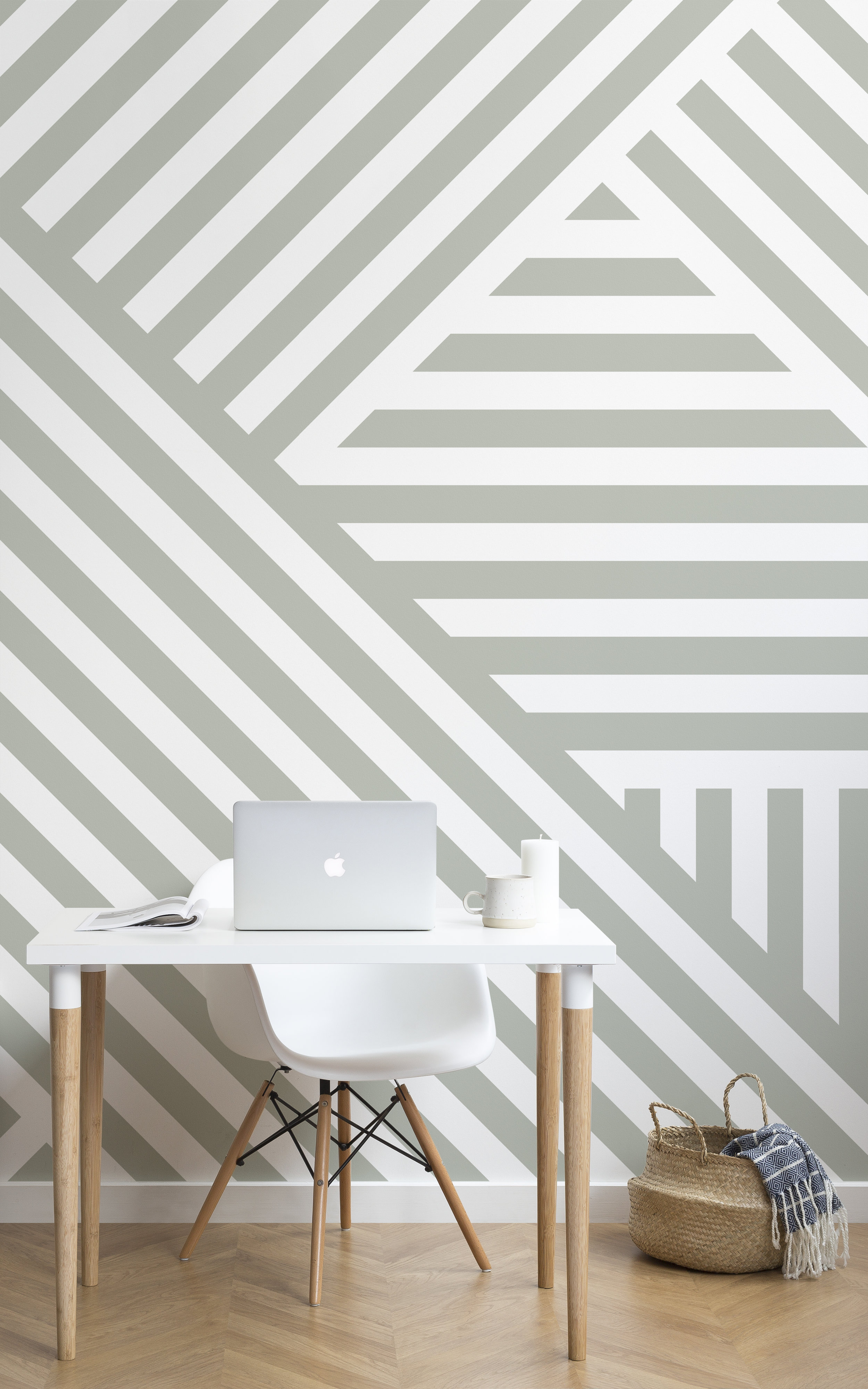
In response to the huge colour trend, sage is also being incorporated in wallpaper designs.
You can then accent the colour with lush plants, as well as hints of matcha and honeydew melon hues in your decor to keep the fresh green feeling going.
The shade isn't intense and it isn't overly overcast — sage is a gentle, matte shade that is easy on the eyes and the mind, so there's no need to hesitate on that desire you have to drench your room's walls in the topical tint.